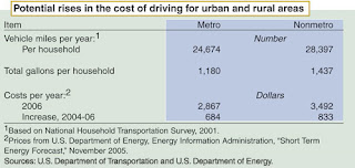
 An old table. Yes, I know my tiny readership just ran or fell asleep. But being a scientist, I like numbers, for they tell us something. This is from the U.S. Department of Agriculture Economic Research Service from two years ago, with fuel around 2.50 a gallon. I use it for one reason, to show average rural miles driven. Then there is this:
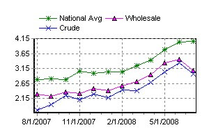
It is an average fuel price graph from August 2007 to June of this year, courtesy of AAA. Rural area's simply have to use more fuel. This is especially important for our area's school districts, rural residents or lower income people. The important thing is the budget percentage transportation takes up as costs go up. Most are still in a daze over the increases, but are either changing behavior( smaller cars, driving less), or have simply absorbed the cost. But my worry is for institutions such as already struggling school districts, hospitals or government services. In many ways, these costs are fixed, and at what point does the child per mile transport cost overwhelm our school districts? It is in the next budget rounds this will take hold, and I do not envy anyone trying to solve it...I will look at home heating oil next....
No comments:
Post a Comment